


White House economic advisor Kevin Hassett on Tuesday struggled to explain a controversial chart that shows coronavirus deaths dropping nearly to zero by May 15.
Hassett's so-called "cubic model" was panned by experts on Monday.
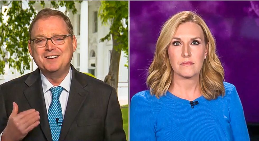
Hassett made an appearance on CNN on Tuesday to defend his "cubic model."
"Why did you do it?" CNN's Poppy Harlow asked. "Did anyone ask you to do this and why are you creating these?"
Hassett explained that he began creating his chart daily because of the ventilator shortage. According to the economic adviser, his chart is made to track the accuracy of other scientific models.
"If you have really wiggly data and you wonder how a curve that someone else has drawn fits the data then you can smooth through the data so your eyeball can compare it," Hassett said. "This is a very standard statisticians toolkit kind of thing to visualize how models are performing relative to the data."
"The Washington Post is reporting Jared Kushner really grasped on to this," Harlow observed. "You said it didn't go to the president or the task force but it was used to push forward a more rapid opening of the economy."
"I never did that," Hassett argued. "I was in the Oval with Dr. Fauci and Birx and always agreed with their forecasts."
"It is true that if you don't understand what cubic fits are and you don't understand the purpose of data visualization," he added, "if you're not a statistical guy that maybe the people who wrote about this, maybe you can't misunderstand what's going on."
Watch the video below from CNN.
